What Is A Histogram In Photography: Decode The Graph
September 12, 2025

These simple histogram examples in photography reveal common exposure shapes and what they mean.
If you’re like me, when I first picked up a camera, the little graph on the back of the LCD screen felt more like a math assignment than a photography tool. I’d press “info” after taking a shot, and a mysterious mountain-like shape appeared. I ignored it for years, relying only on the brightness of my screen, which, as I learned the hard way, is incredibly unreliable.
Once I sat down to understand that graph—the histogram—it completely changed how I exposed my photos. Suddenly, I wasn’t guessing whether my highlights were blown out or my shadows were pure black. I had proof, right there in front of me. Let’s break down histograms in plain language so they actually make sense.
Histogram Photography Definition
In photography, a histogram is a graphical representation of the tonal values in your image. Let’s start simple. If you’re wondering what a histogram looks like, picture a mountain-like bar chart — the left slope shows shadows, the peak shows midtones, and the right slope shows highlights. So when someone asks, What is a histogram in photography—the easiest way to explain is: it’s a map of your photo’s exposure. Instead of guessing by eye, you get an actual chart of where your shadows, midtones, and highlights sit.
For example, if I shoot a snowy field on a sunny day, most tones will sit on the right side (the bright side). If I photograph a dark alley at night, the tones will sit on the left (the shadow side). A balanced portrait often creates a mountain-like shape in the middle.
The beauty of this tool is its instant feedback. Studying histogram examples photography can make it easier to predict how your image will look before editing. The histogram always tells the truth, regardless of how bright or dim your camera screen appears in different lighting conditions. That’s what makes understanding histogram photography such a game-changer for beginners.
Achieve Stunning Photo Contrast with Luminar Neo
Try Supercontrast NowWhat does a Histogram Look Like

How to Read a Histogram in Practice
Histograms might look like confusing spikes and slopes, but you just need to focus on Shadow and Highlight Clipping and Color Channels. Master these, and your exposure decisions will become much easier.
Shadow And Highlight Clipping
One of the main reasons I pay attention to histograms is to avoid clipping. Clipping simply means losing detail in the shadows or the highlights.
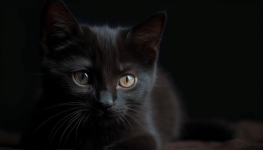
Shadow clipping happens when your histogram is slammed against the left wall. That means your blacks are pure black, with no detail left. Think of trying to capture a black cat in a dark room—if you push exposure too low, the cat just becomes a silhouette blob.
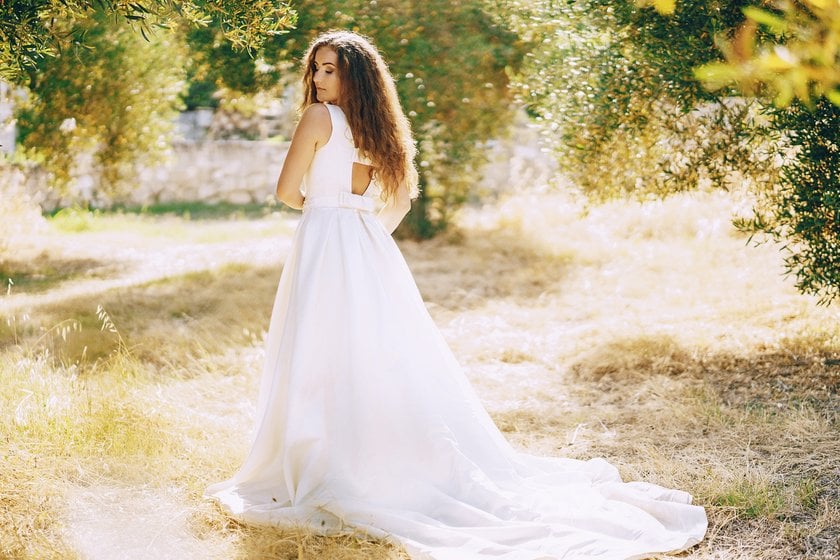
Highlight clipping is when the graph spikes against the right edge. That’s when your whites are pure white, with no detail. Picture shooting a wedding dress in full sun—if the highlights clip, all the fabric texture disappears.


The ideal histogram photography depends on the scene, but generally, you want most of the tones away from the extreme edges. Unless you’re intentionally going for a high-contrast look, clipped areas usually look amateurish.
Color Channels
 Now, here’s where it gets a little more advanced and fascinating. Most cameras allow you to view the brightness histogram and separate color channel histograms for red, green, and blue.
Why care about this? Because sometimes, one channel clips while the others look fine. Imagine a bright red flower in the sun. Your overall histogram may look safe, but the red channel could be pushed all the way to the right, blowing out the details in the petals.
This is especially important for landscape shots with strong skies. If you’ve ever struggled with dehaze photos, you’ve seen how certain colors—often blues—get pushed hard. Watching the color histograms helps you protect those details before you even start editing.
Your AI-Powered Photo Editor for MacOS and Windows
Discover Now!Histogram And Exposure
 Understanding exposure goes beyond just judging if a photo looks bright or dark. The histogram gives a clear picture of how tones are distributed, helping you protect important details in every shot. By learning to read it, you can see exactly where shadows are too deep, highlights are blown, or midtones are nicely balanced—long before you start editing. Let’s explore three common scenarios to see how histograms guide real-world exposure decisions.
1. Underexposure
When an image is underexposed, the histogram leans to the left. Shadows take over, midtones shrink, and highlights almost disappear. Details in dark areas can get lost, making textures and subtle elements vanish. Even with advanced tools like masking photos, some shadow details can’t be fully recovered once they’re lost.
2. Overexposure
On a histogram, overexposure shows up as a spike on the far right — a sign that too much light hit the sensor and bright areas have been washed out.
Shoot a snowy field or a bright sky without adjusting exposure, and those highlights can become flat, featureless white. Once detail is lost, there’s only so much editing can do, so keeping an eye on the histogram helps preserve texture in clouds, clothing, and reflective surfaces before it’s too late.
Sometimes I use color transfer to harmonize tones between multiple shots, especially when highlights are tricky.
3. Correct Exposure
Now, the best histogram for photos doesn’t mean a perfect bell curve every time. It means that the tones are spread out in a way that matches your creative intent. For a moody night street shot, it’s okay if the histogram leans left. For a bright, snowy landscape, leaning right makes sense. I often want a nice middle distribution for portraits—so skin tones land in the midtones, with no harsh clipping.
Photography histogram examples are useful here:
Portrait with soft lighting → histogram concentrated in the mid-range.
High-contrast sunset → two peaks, one on the left for shadows, one on the right for highlights.
Foggy morning → histogram bunched in the middle, showing mostly midtones.
Once I understood how to read photo histogram, I stopped panicking about whether my LCD screen looked too bright or too dark.
Should You Set Exposure Using Histogram?
 Here’s the honest answer: yes and no.
Yes, because histograms give you objective feedback. If you want to make sure you’re not clipping shadows or highlights, nothing beats it. Especially in tricky light, understanding histograms in photography saves your image.
But also no, because photography isn’t just about data—it’s about mood. Sometimes, I want to crush the blacks for drama. Other times, I intentionally blow out highlights for a dreamy look.
The trick is balance. Use the histogram as a guide, not as a strict rulebook. For example:
Shooting landscapes? I check my histogram religiously.
Shooting creative portraits? I sometimes ignore it and go with my gut.
In other words, understanding histograms allows you to break the rules knowingly. Without it, you’re just guessing.
Closing Thoughts
At first, that mountain-shaped graph on my camera felt intimidating. But once I bothered to look closely, it became obvious: it’s just a translator between light and detail. The histogram tells you straight away if you’re crushing shadow detail or blowing out highlights. There isn’t one “perfect” shape — the right curve depends on the subject, the light, and what you’re trying to say. Use it enough, and reading it becomes automatic. Next time you’re shooting, don’t ignore that little graph: it isn’t cold math, it’s storytelling in numbers — and once you learn it, you’ll stop second-guessing your exposure.


