Background of WGSN and Coloro
Last Updated on January 16, 2025
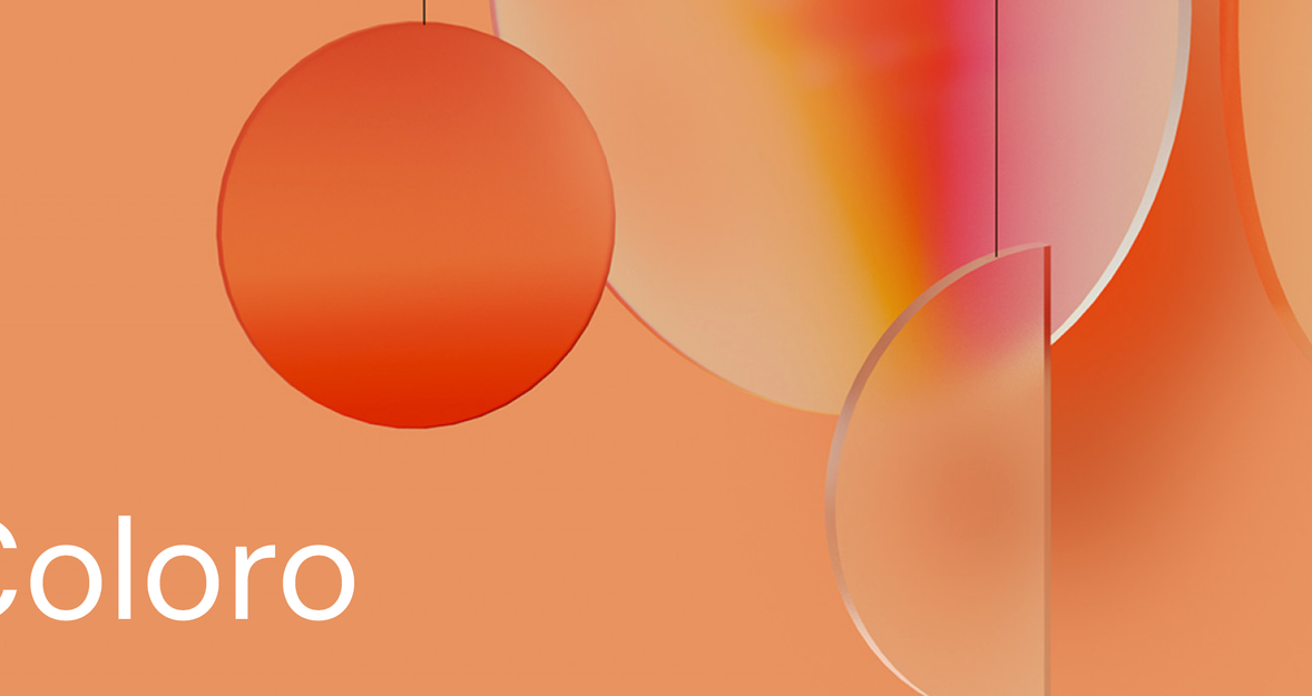
WGSN And Coloro Presented What Colors Will Rule In 2024. Digital Lavender Is Now A Thing Of The Past, A New Color Has Come To Reign In Industries Such As Marketing, Advertising, Fashion, The World Of Cosmetics, And Much More.
The Color of the Year is a highly anticipated annual trend that sets the tone for various industries. WGSN and Coloro, renowned authorities in color trends, have unveiled their selection for 2024: Apricot Crush. This captivating hue is poised to make a splash in fashion, marketing, advertising, and cosmetics. With its warm and vibrant tones, Apricot Crush brings a fresh energy to the color palette. In this article, we'll explore the impact of this exciting apricot crush color and how it can revolutionize the world of photography, particularly with the innovative Luminar Neo tool and its powerful photo masking capabilities.
Background of WGSN and Coloro
Staying ahead of the curve is crucial in the ever-evolving world of color trends. That's where WGSN, a leading global trend forecasting agency, comes into play. With their finger on the pulse of emerging hues and shades, WGSN provides invaluable insights into the future of chromatic expressions. Their team of experts tirelessly analyzes market dynamics, cultural influences, and industry shifts to identify the next big chromatic phenomena.
Coloro, a chromatic system developed in collaboration with WGSN, adds another layer of sophistication to the world of 2024 color trends. This innovative system eliminates traditional color categorization, offering a fresh and comprehensive approach.
Instead of relying solely on subjective interpretations, Coloro utilizes a scientific and standardized method to classify hues based on their distinct chromatic attributes. By assigning each hue a unique code, Coloro enables seamless communication and precision in hue selection across industries.
Emphasizing Influence and Credibility
The influence and credibility of both WGSN and Coloro cannot be overstated. Their combined expertise and extensive research have shaped the trajectory of chromatic trends for years. Designers, marketers, and industry leaders rely on the insights provided by WGSN and Coloro to make informed decisions and create visually captivating experiences. These organizations serve as trusted guides, offering a wealth of knowledge and guidance in navigating the ever-changing landscape of color trends.
With WGSN's trend forecasting prowess and Coloro's innovative chromatic system, the future of hues is in capable hands. Together, they pave the way for imaginative expressions, bold palettes, and exciting possibilities.
In the upcoming chapters, we will explore the profound influence of the next year, specifically within the realm of photography. The innovative tools and seamless integration of WGSN and Coloro enable photographers to breathe life into their creative visions, embracing the captivating palettes that define the year's chromatic expressions.
Your AI-Powered Photo Editor for MacOS and Windows
Try it for free!The Evolution of Color Trends
Colors are vital in multiple industries, serving as powerful tools for communication, branding, and emotional connection. From fashion to marketing, advertising to cosmetics, trending color palettes set the stage for captivating experiences. By carefully selecting the right hues, businesses can convey specific messages, evoke desired emotions, and resonate with their target audiences. The ever-changing landscape of chromatic expressions constantly pushes boundaries and influences consumer behaviors.
Examples of Past Color of the Year Choices and Their Influence
Past Color of the Year choices have left an indelible mark on the creative landscape. From vibrant and energetic tones to soothing and calming hues, each selection has made waves within the industry. For instance, the selection of Digital Lavender in the previous year sparked a resurgence of purple shades in fashion and beauty.
Another year's choice of Living Coral brought warmth and optimism to design and marketing campaigns. These examples demonstrate how Color of the Year can shape trends, influence consumer preferences, and ignite a cascade of creativity.
As we delve further into the 2024 shade trends, it becomes evident that chromatic expressions hold immense influence across industries. The Color of the Year serves as a guiding light, setting the tone for creativity and fostering the emergence of new design directions.
So what is the color of the year 2024?
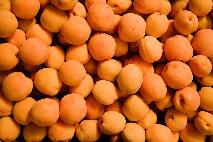
Introducing Apricot Crush: The Color of 2024
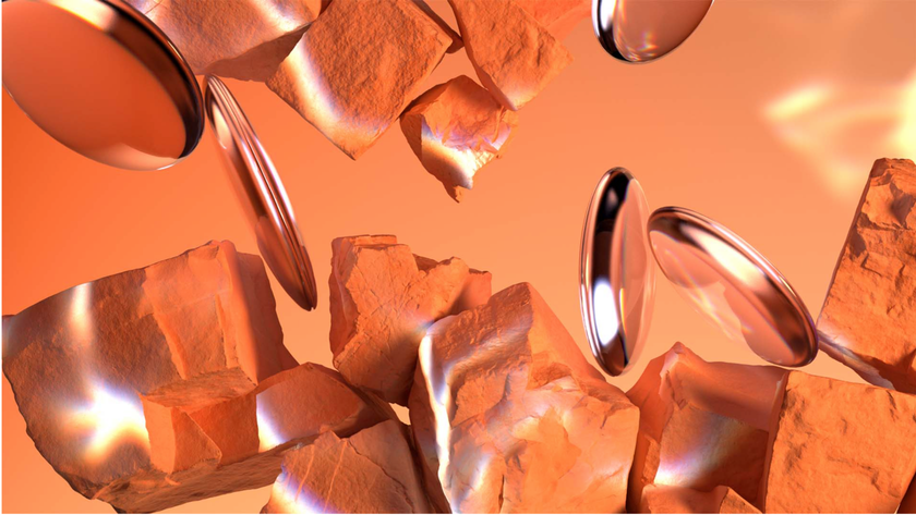
This delightful shade blends warm undertones of apricot with subtle hints of coral, creating a harmonious and inviting palette. The fusion of these colors gives this hue a vibrant and energetic aura, making it an ideal choice for creative expression. Its soft and luscious appearance evokes a sense of warmth and optimism, inviting individuals to embrace its charm.
Explaining the Inspiration Behind the Color
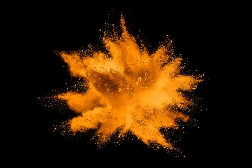
The inspiration behind Apricot Crush stems from the desire to infuse creativity and positivity into our lives. The color draws inspiration from nature's bountiful harvest, reminiscent of the sun-kissed apricots found in flourishing orchards. The radiant glow of the fruit and the joy it brings serve as a metaphor for embracing new beginnings and vibrant experiences. It encapsulates the essence of growth, vitality, and the excitement of embracing the future.
Emotional and Psychological Associations of Apricot Crush
Apricot Crush elicits a range of emotional and psychological associations. Here are some of the key associations linked to this captivating hue:
- Warmth and Joy: the coloring evokes feelings of warmth and joy, reminiscent of sunny days and cheerful moments.
- Creativity and Inspiration: The vibrant energy of Apricot Crush sparks creativity and stimulates inspiration, making it a color that encourages innovative thinking.
- Positivity and Optimism: This hue radiates positivity and optimism, uplifting spirits and fostering a sense of hopefulness.
As the Pantone Color of the Year for 2024, Apricot Crush embodies the spirit of growth, vitality, and positive energy. Its distinctive combination yields an alluring tint that appeals to people emotionally and psychologically.
In the upcoming chapters, we will delve deeper into the diverse industries and applications where Apricot Crush is set to make a profound impact, fueling creativity and inspiring photographers to explore new horizons in their visual storytelling.
Advanced yet easy-to-use photo editor
Get Luminar Neo NowApricot Crush in Fashion and Design
Apricot Crush, with its captivating and versatile hues, offers exciting possibilities for incorporating it into fashion collections and design aesthetics. Here are the key points highlighting its potential:
Fashion Collections:
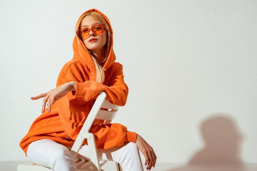
- Apricot Crush, with its warm and sophisticated tones, can be incorporated into clothing designs, offering a unique answer to the question of what color is apricot in clothing.
- The color can be used in clothing designs to add a touch of warmth and sophistication.
- It complements various colors, including soft neutrals, earthy tones, and even contrasting bold shades.
- Designers can experiment with Apricot Crush in various garments, such as dresses, blouses, or accessories, to create eye-catching ensembles.
Interior Design and Home Décor:

- Apricot Crush can infuse living spaces with a sense of energy and warmth.
- It can be applied to furniture, textiles, or accent pieces to add a vibrant touch to a room.
- This hue pairs well with natural materials like wood or rattan and with metallic accents for a modern twist.
Examples of Designers and Brands:
- Renowned fashion designers and brands have already embraced Apricot Crush. This hue falls within the spectrum of warm and earthy tones in their collections, showcasing its versatility and answering the question of “What color is apricot close to?”.
- High-end fashion houses and emerging designers have incorporated a shade of the next year in their runway shows and ready-to-wear lines, demonstrating its trend-setting potential and ability to captivate fashion enthusiasts.
Even photographers can harness the power of Apricot Crush in their images with the help of AI image editing tools like Luminar Neo. By intelligently adjusting and enhancing colors, photographers can create stunning visual effects that make their photos come alive.
Luminar Neo, with its advanced capabilities and user-friendly interface, offers photographers a valuable tool to enhance and optimize the colors in their images, including the vibrant tones of Apricot Crush. Whether it's fashion photography, interior shots, or creative compositions, Luminar Neo's AI image editing features empower photographers to elevate their work and showcase the beauty of color and other captivating colors.
Apricot Crush in Marketing and Advertising
Apricot Crush presents a myriad of opportunities for creating impactful marketing campaigns. Here's how this captivating hue can be effectively employed:
Brand Identity: Incorporating this hue in branding elements, such as logos, packaging, or website design, can establish a distinctive and memorable brand identity.
Visual Appeal: The warm and vibrant tones capture attention and evoke positive emotions, making it an excellent choice for visually captivating advertisements.
Product Highlighting: the color can strategically highlight specific products or features within a marketing campaign, drawing the viewer's focus and enhancing their perception of value.
Understanding the compatibility of Apricot Crush with other colorings is also crucial. Complementary colors such as soft greens, cool blues, or warm neutrals can create harmonious and visually pleasing combinations. By considering what dyes go with apricot, marketers can leverage the inherent qualities of these while crafting cohesive and impactful campaigns.
Apricot Crush in the World of Cosmetics
Color offers exciting possibilities for incorporating its captivating chromatic expressions into the world of beauty and cosmetics. Here are some potential applications:
Makeup Palettes: Apricot Crush can serve as a versatile shade in makeup palettes, allowing for the creation of stunning eye looks, blushes, and lip products.
Nail Lacquers: This alluring hue lends itself beautifully to nail lacquers, adding a touch of warmth and vibrancy to manicures and pedicures.
Skincare Packaging: can be incorporated into the packaging design of skincare products, enhancing their visual appeal and reflecting a sense of vitality.
Suitability for Different Skin Tones and Product Categories
The hue exhibits a versatile nature that complements a range of skin tones and product categories:
Skin Tones: The warm undertones of Apricot Crush make it suitable for various skin tones, from fair to deep, adding a subtle and flattering touch of color.
Product Categories: it can be seamlessly incorporated into various cosmetic product categories, such as foundations, blushes, bronzers, and lipsticks, offering versatility and creativity to beauty brands.
By understanding what colors go with apricot, cosmetic brands can create cohesive and visually appealing collections that cater to diverse preferences and inspire individuals to explore beauty.
Conclusion
In summary, Apricot Crush, the Color of the Year for 2024, embodies a warm and vibrant chromatic expression. So, what does the color apricot look like? It is a captivating hue that exudes sophistication and vitality. With its versatile nature, Apricot Crush has the potential to influence various industries, from fashion and design to marketing and cosmetics.
Embracing Apricot Crush in our own lives allows us to tap into its creative potential and add a touch of warmth to our daily experiences. As we bid farewell to Apricot Crush, we look forward to the emergence of new color trends and encourage readers to stay tuned and explore the beauty of colors in their lives.