Meaning Of Colors In Photography
November 18, 2024
From our earliest years, we learn that you push the red “stop” button and the green “go,” and anything in yellow brings joy and optimism. In photography, these associations enhance the impact of images by adding warm and cold tones.
Knowledge of the psychology of color allows the author to work with our expectations and emotions: pastel tones hint at lightness and romance, or contrasting combinations are used for some drama or tension in the scene. These patterns help the photographer catch the moment and reveal it emotionally.
This guide will explain the psychology of photography and how to use it to make great pictures.
What is Color Psychology
Color psychology deals with how it induces human consciousness, emotions, and behavior. It looks at what feelings different shades create and how they affect our moods and can even affect our choices.

The idea of the psychological influence of colors has deep roots. Colors were used in healing and rituals as far back as Egypt and China because people believed each shade had extra energy. After all, at the turn of the 20th century, psychologists and researchers like Max Luscher and Faber Birren systematically studied color science and its relation to the human psyche.
Our perception of a photograph comes from the reading of color accents used to highlight the main elements of the image. The right color gives an image visual impact and contrast. Plus, it provides a psychological response to create an extra connection to a shot.
Explore the Fun of Color Changes in Your Photos
Begin NowBiological vs Cultural Color Perception
Primitive society linked color with elementary things (blood, milk, seeds, earth) and elements (fire, fire, sun, earth) — white, red (yellow), and black. In Christian times, the colors and meanings were as follows:
white (holiness, purity, beginning);
yellow (light, power, later betrayal and falsehood);
red (blood, love, power);
blue (divine wisdom, hope, Madonna);
green (garden of paradise, grace);
black (death, humility).
The human eye can physically perceive millions of colors. However, not everyone can distinguish certain hues. Some have color blindness—the inability to see colors caused by having nonfunctional or lost cone cells in the retina. Even among individuals with normal color vision, the density and patterning of cones vary somewhat, so we see colors differently. This variation is one reason you might find two people whose perception of a color’s shade differs.
Color categorization is also culturally specific and acquired linguistically. In English and many other languages, there is an incredibly large vocabulary of color terminology. The Himba people of Namibia don't have words for blue and green but regard them as shades of one color.
The Piraha language, whose speakers live in the Amazon, has no specific color terms; instead, people describe colors in phrases. Rather than using a word for green, they might choose phrases like “like the leaf” or “fresh,” which links color to the context of nature and not an abstract idea.
In Japan, “Aoi” was long ago symbolized as green and blue, a combination still visible in the green traffic lights often used as blue.
Perception is a blend of biology, language, and shared cultural understanding of how we interpret and communicate about color and how different cultures understand and agree about such things.
How Does the Color Affect the Mood of a Photo
 Color plays a major role in a picture's mood and emotional tone, affecting how the viewer senses and connects to the image. Research has demonstrated that warm hues, like red, orange, and yellow, generate heat sensations, such as excitement, passion, and energy. In contrast, cool hues like blue and green produce a pleasant quietude, confidence, and tranquility.
Steve McCurry and Annie Leibovitz are masters at using colors in photography. McCurry, famed for his Afghan Girl image, uses colors like red and green to convey the stories of his subjects by painting life's depth of emotion, hope, and human resilience. Similarly, Leibovitz makes celebrity portrait subjects stand out in color by using bold choices in images of John Lennon and Yoko Ono.
Why is color important in photography? In photography, color is a powerful way to form emotions and have a deeper narrative. Other uses of color are visual tools to help you focus attention.
Warm Colors
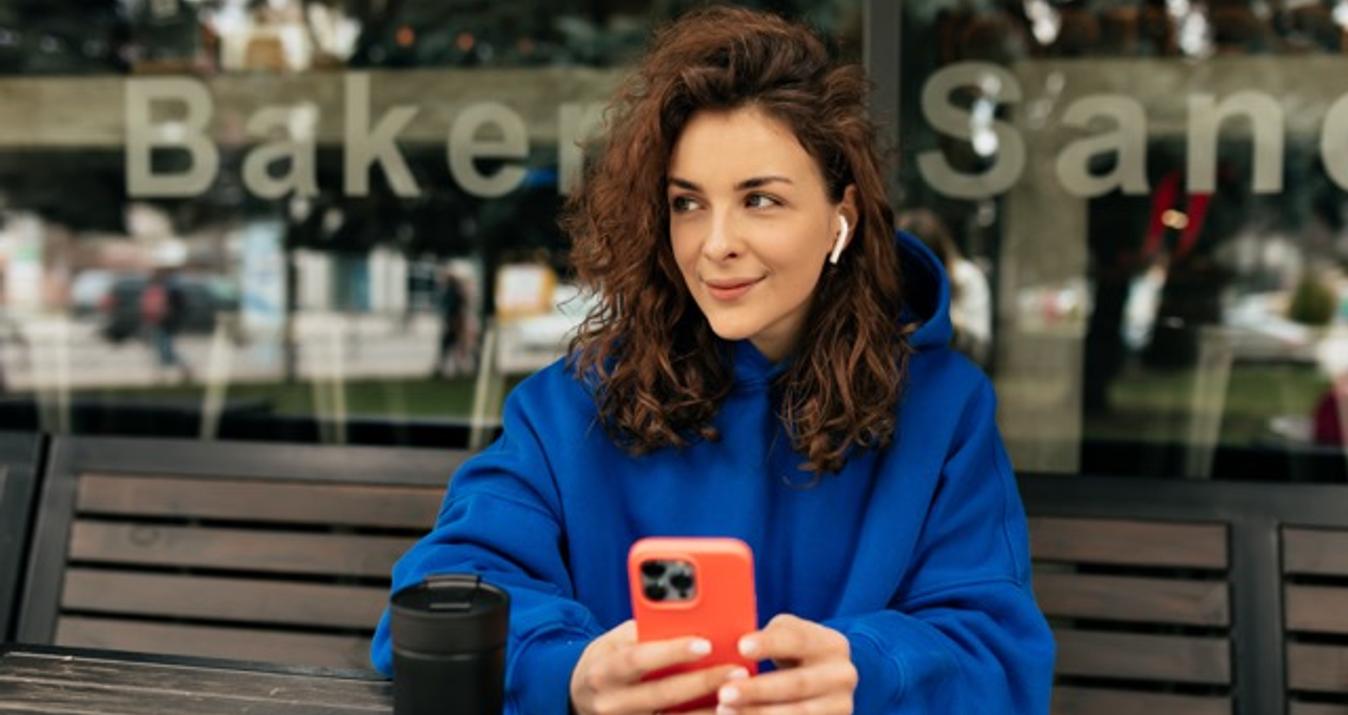
 Shooting in the early morning or late evening gives warm colors in photography — a sense of coziness and energy. The warmth helps to catch focus within the photo and transfer emotional closeness to the frame.
Red is usually the color of love. In Syria, red signifies readiness, quickness, the power to start things, and quickening movement. In China, red represents luck and prosperity.
Yellow is the most energetic color in the palette, representing happiness and sunlight. It is often used as an accent.
Orange is a bright color related to autumn. It is less provocative and more friendly than red. Even psychologists use this color on clothes in color therapy, where it fights depression and gloomy moods.
Cool Colors
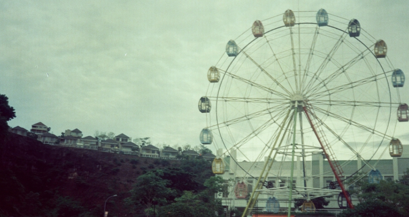
 Cool colors in photography can express a sense of calm or add depth to the shot. In architectural photography, cool tones help to highlight the scale, clarify the composition, and even emphasize the sophistication of the scene.
Blue is a color related to the sky and water. Its qualities are calmness, responsibility, and trust. Blue can calm the mind, relax it, and stimulate the creative mind.
Green is nature's color associated with life, growth, and harmony. Because of its proven calming and relaxing properties, green is usually used to create a receptive atmosphere in parks and gardens.
Purple means magic and luxury. It can make the image mysterious.
Neutral Colors
 Neutral colors in photography are color schemes that do not elicit strong emotions, such as white, gray, black, and brown. They are often used to balance or harmonize other colors or to highlight them.
White is the color of purity and peace. Its clean, minimalist, elegant look illuminates the subject and adapts the overall tone.
Grey is a color of neutrality, calm, and balance. Gray provides a wonderful backdrop for an elegant, restrained photograph or a neutral prop that doesn’t demand all attention from features in the main body of the image.
Black is often used to create contrast and dramatic effects and add depth and expression to an image. Its usual attributes are elegance, mystery, power, and authority.
Brown is often associated with nature, stability, reliability, and comfort. It can invoke a feeling of warmth and coziness. Brown lends depth and a sense of warmth to photography; it’s usually used in portrait photography or for creating natural, organic images.
Tips for Using Color in Your Photography
It is no wonder that a photographer’s skill is unmatched. He can capture a moment, but he also plays with the color palette, changing moods and emotions from one shot to the next. How can a different color make an ordinary photo an actual work of art?
Your Go-To for Masterful Colorscape Editing
Try it NowUse Bold Colors
Add vibrant colors like red, orange, or bright yellow. These can impact the image, making it visually striking and immediately attention-getting. However, they need to be adjusted to avoid blinding the viewer.
Mix bold and calm colors, such as black, white, or grey, so they don’t look heavy visually. These can be used as accents or focal points in the image.
Play with Pastel Colors
 Soft, muted colors are a good idea for producing serene and calm images. They are often used in portraits and outdoor photography to yield softness or nostalgia.
Elements like lighting, color, and composition shape the mood in photography. When shooting, pay attention to lighting. Pastel tones soften when diffused light is used over them rather than harsh or washed out. Additionally, minimal shadowing will help maintain the gentle aesthetic.
Go Monochromatic
Photographers create a monochromatic scheme using variations of one color, making the images appear unified. Sepia is nostalgic but richly textured.
Vary the saturation and brightness of your chosen color to achieve depth from monochromatic colors. For example, bright browns can appear dominant in highlights in sepia, as can dark browns in shadows.
Highlight a Colored Subject
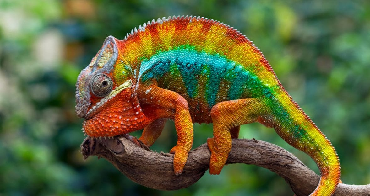
A strong color contrast can draw attention to a particular subject, making it stand out against a more neutral or subdued background. Secondary colors in photography (green, orange, and purple) add depth and variety, often creating dynamic compositions that draw the eye.
Choose backgrounds with muted or complementary colors to allow the subject's color to pop. A shallow field depth (blurry background) can help isolate the subject.
Feature One Dominant Color
 When you focus only one color on the center portion of your image, you create a powerful visual and story that reinforces and tells a story. This approach uses color as a visual anchor.
The composition should lead your eye over to the dominant color. You can do this through selective focus or leading lines leading to the subject. Place the color centrally (or off-center) for your desired result.
Experiment with Complementary Colors
Complementary colors lie opposite each other on the color wheel (e.g., blue and orange, red and green). Together, they give a good vivacious contrast, making a pop image. That’s especially helpful in building visual interest and generating dynamic compositions.
Color definition in photography requires basic knowledge. Be careful not to use complementary colors too much. You need to draw focus without blocking the image. One of the color photography examples is a stunning sunset scene with a blue sky and orange horizon.
Play with Color Temperatures
Different light sources have different color temperatures (warm vs. cool). For example, daylight has a cool (blue) cast, while tungsten lighting has a warm (orange) cast. To control the mood, you can adjust the white balance settings on your camera or edit.
If you want to get the “stylish look,” you can't misuse the white balance. Setting the white balance to tungsten when taking shots outside will create images of glowing, warm golden tones, which can evoke a cozy, vintage (or time capsule) feel.
Use Colors to Evoke Emotions
 Colors are psychologically linked to emotions. Pick colors that meet the mood or message that you want to send. For example:
Red: Passion, energy, love, danger.
Yellow: Happiness, optimism, warmth.
Green: Calmness, nature, growth.
Blue: Trust, tranquility, sadness.
Purple: Creativity, luxury, mystery.
However, digital photography's great advantage is that colors can be easily adjusted after shooting. Photographers can change the color of their photos with Luminar Neo to fit the desired mood or style. The new AI color transfer feature locates objects and applies colors from similar elements. The sliders allow you to fine-tune the result to provide you with control over the results you desire.
Final Thoughts
Photographers don't become professionals in a day. Colors have the power to tell a story, evoke emotions, and give depth to an image, but it all doesn’t come easily. The most well-known photographers have dedicated years to perfecting their skills, learning how color interacts with light, and learning about composition and mood to produce amazing photos. Basic, easy to practice, don't rush.
Try all, revisit guides like this, take notes, and experiment until you've built a strong foundation. With more persistence, you’ll develop your own personal, individual style.
FAQ
What are the principles of color photography?
It involves adjusting the hue, saturation, and luminance of individual colors. 1. Hue. Changes the color itself. For example, shifting the hue of blue can turn it into teal or purple. 2. Saturation. Adjusts the intensity of a specific color. 3. Luminance. Alters the brightness of a specific color.
What is the color theory in photography?
The theory explains how different colors interact with one another. Once you learn how they work, you can compose and capture more interesting and compelling photographs.
What color catches the eye first?
In many cases, the human eye sees yellow and bright variations of green first. This is because these colors are in the middle of the color spectrum.
What is the rule of color in photography?
For a complementary color palette, use two colors on opposite sides of the color wheel. These schemes are well-suited for photography because they add contrast, resulting in pictures that “pop.”
What is photography color correction?
Color correction is a technical process of adjusting the levels of different colors within an image to resemble more or less natural hues.