Composition In Portrait Photography: Tips For Balanced Shots
September 19, 2024

Explore essential composition techniques in portrait photography with our guide. Learn how to take your portraits to the next level and truly captivate your audience!
Have you decided to master portrait photography? Start by learning the essentials of how to compose a portrait because the perception of your pictures greatly depends on your compositional skills. We will guide you to stunning photos with our portrait photography composition tips. Promise that you will learn a lot or refresh your existing knowledge!
Keep reading to explore compositional storytelling and discover how to use composition to convey emotions, tell stories, and create powerful portraits that resonate with viewers. And once you've captured the perfect moment, don’t forget a touch of editing with a good portrait photography editor can make all the difference!
1. Learn Composition Rules for Portrait Photography
 Rule of Thirds
You’ve probably heard about the Rule of Thirds if you’ve read any photography guide before. This isn’t just repetition; it’s an affirmation of how crucial this simple technique is.
Imagine your frame divided into a 3x3 grid. Placing your subject along these lines or at their intersections is strategic. It leverages the natural way your eyes and mind engage with an image. Cameras like the Canon EOS 6D Mark II even come equipped with settings to overlay these grid lines right on your LCD screen, making it easier to align your shots perfectly.
Negative Space (Breathing Room)
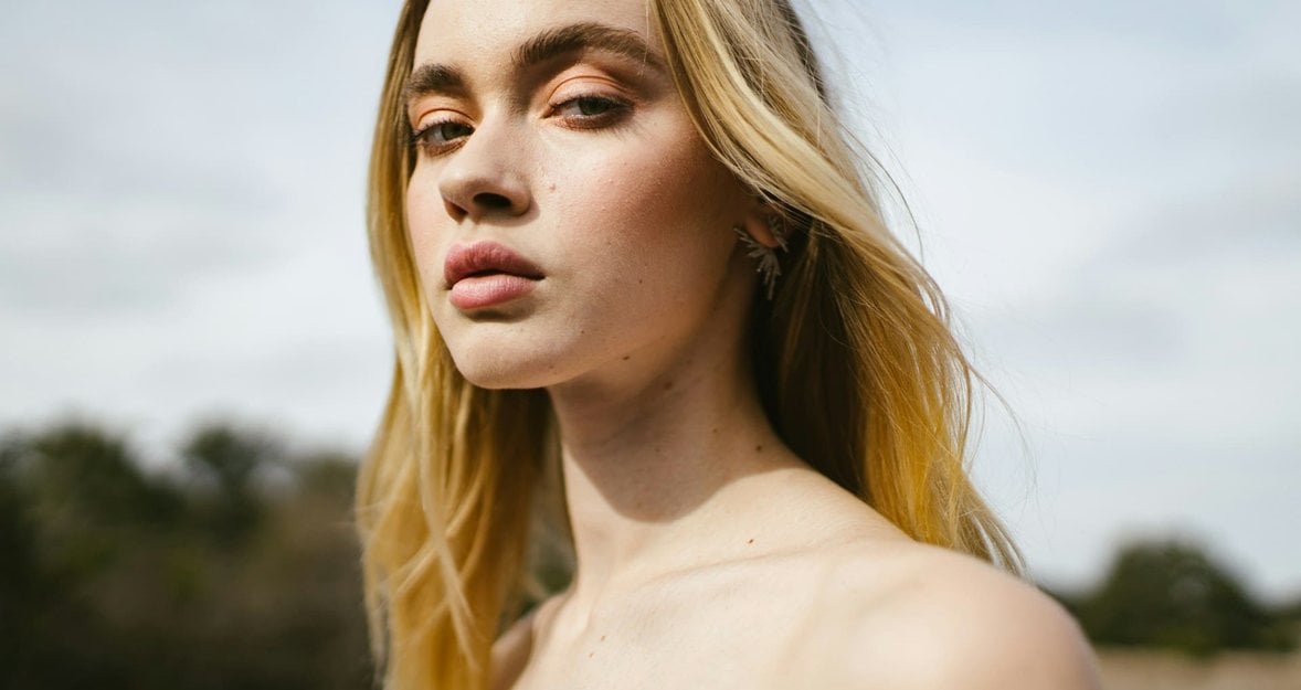
No portrait needs to have the subject’s face crammed into every corner of the frame. Instead, try framing your subject to one side, leaving a swath of “empty” space. This not only anchors your subject in the frame but also draws the eye more effectively by using the negative space. When you combine this with the Rule of Thirds, you set the stage for a photo that feels both intentional and intriguing.
Frame within the Frame
To really make a statement, have your subject fill the frame. This technique eliminates any unnecessary background distractions and focuses all attention on the subject. It’s about capturing the essence of the moment and the emotions of your subject up close.
Adding a secondary frame inside your shot is a silently powerful way to capture and direct attention. It’s like visually whispering to your viewers where to look without saying a word. This frame can be anything — a doorway, a pair of hands, or even an arch. Try, and you won't regret it.
2. Choose Scale and Perspective
 Ever noticed how different objects look in size depending on their distance from the camera? That’s scale and perspective at play, and it’s a fantastic way to add depth to your portraits. Consider elements like stairs or columns—these can appear smaller when farther away and larger up close. Don’t just stick to wide angles to show depth; even a telephoto lens, like the 85mm, can beautifully showcase depth by compressing your scene. But if you notice any distortion in an image because of the wide angle, you can easily correct it with Luminar Neo’s lens correction tool!
3. Embrace The Art of Subtraction
 When it comes to powerful imagery, sometimes less really is more. Take a rider and their motorcycle, for example. You could show everything, but why not keep it simple? A glimpse of the headlight, helmet, and handlebar can tell the whole story, making the composition far stronger by cutting out the clutter. This approach helps viewers focus on what’s important without the distractions of unnecessary details.
5 Tips for Dramatic Portrait Photography
Learn more4. Emphasize Size Through Cropping
 Want to make something look bigger? Crop it! Cropping an image so that the subject appears to barely fit within the frame exaggerates its size, making it seem larger than life. Whether it’s a hat, a flower, or a sword, cropping can play a crucial role in how big—or small—something feels in your photo.
If you're unsure how to best compose your photo, try using the Composition AI feature in Luminar Neo! This AI tool was trained on hundreds of photos from talented photographers, ensuring that your picture will be optimized to highlight its best features!
5. Layer for Depth
 Depth isn’t just about what’s in focus—it’s about layering your scene. Arrange elements at different distances to create a foreground, middle ground, and background. This not only adds depth but also helps guide the viewer’s eye through the image in a natural, engaging way. A shallow depth of field can enhance this effect, drawing attention to your main subject while softly blurring out the rest.
6. Contrast Spacious and Confined Settings
 Feeling of space or confinement can be conveyed through how you frame your subject. For openness, allow plenty of room around your subject with no overlapping elements. For a confined feeling, place your subject next to something like a wall, using a narrow field of view to heighten the effect of the enclosure. This contrast can dramatically affect how the viewer perceives the mood of the photo.
7. Incorporate Texture
 Texture adds emotion to your portraits. Whether it’s the roughness of concrete or the softness of grass, textures convey feelings. Use them thoughtfully to complement the mood you want to express in your photo, adding layers of narrative and depth to the visual story you’re telling.
8. Add Shine for Visual Interest
 Shiny elements can bring a new dimension to your composition by reflecting light and creating intriguing contrasts. Whether it’s a shimmering body of water or a gleaming glass window, these highlights can enhance the visual appeal of your photo without overwhelming your main subject.
Portrait Lighting Setup: 5 Impressive Suggestions
Learn more9. Choose Orientation to Convey Space
 Your choice of frame orientation—horizontal or vertical—can influence how space is perceived in your photo. Horizontal frames tend to expand the width, while vertical frames emphasize height. Use lines within your composition to suggest continuation beyond the frame, subtly telling the viewer there’s more to the scene than what’s captured.
10. Break the Rules
 Got the basics down? Great—now let’s twist them! Mastering portrait photography isn’t just about following the rules; it’s about knowing when to break them. This doesn’t mean forgetting what you’ve learned but rather bending the rules to make your photos pop with originality and expression.
The more you experiment, the better you’ll understand what works for your unique style. Some of the most breathtaking portraits stand out because they dare to be different. Reshape images creatively to emphasize emotions, add a surreal touch, or enhance composition. Embrace the freedom to push boundaries and see where it takes your photography!
Bottom Line
Which composition technique you choose for portrait composition photography is entirely up to you! Whether you leverage leading lines, master the Rule of Thirds, experiment with negative space, or frame within a frame, we are confident that your shots will look fantastic. Each method offers a unique way to enhance your storytelling and engage your viewers. Congrats on stepping up your game in portrait photography!

 Rule of Thirds


