What Is Color Grading?
February 14, 2023
In our review, we will give you the color grading definition and tell you how to use it. Read, enjoy and enhance your pictures!
Color grading is a process that occurs photographers use to change the visual tone of an image. Simply put, it is used to control the grading necessary for a video or photo. After the final color grading, the aesthetics of the image will change completely.
Whereas the artist, when creating, uses smooth transitions as it is subject to his perception of the world, in printing all colors are considered in terms of functionality and serial post-production. Looking closely at the printed grading picture, you can see also how it "crumbles" into many small dots. Such images are called bitmap images. The gradation of such dot pictures is conveyed by raster elements, which to the naked eye merge into one continuous workflow. How do you use this artistic technique in photography? We will tell you about it in our review and explain its advantages and disadvantages compared to other techniques.
What Is Color Grading In Photography?
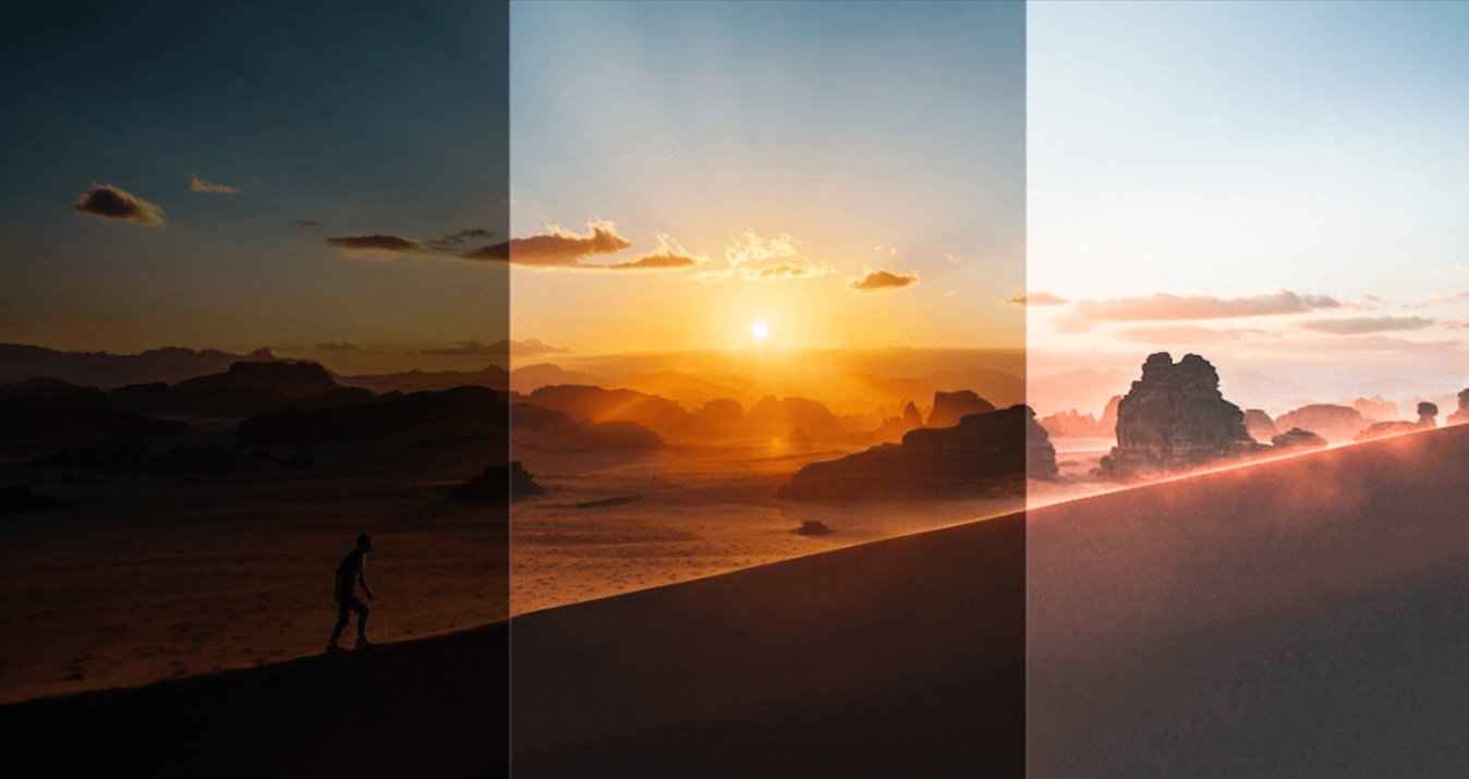
Color grading is an artistic technique that reflects the gradual transition from a denser shade of common color to a bright shade of color or vice versa. In an overall image, it conveys the depth and photo vibrance of tones and gives the motion picture a realistic and three-dimensional appearance. An expanded color palette, which opens with white and closes with black, can also be called a graduation. This concept includes not only all shades of contrasting black and white mid-tones, but also all grayscale transitions, and the full-color dynamic range with all its halftones. By mixing shades, the painter applies graduation to enliven his canvas.
Many people, including photographers, often mistakenly confuse color grading tools and basic color correction-the two concepts are different in many ways. Generally, color correction is simply correcting a few aspects of an image to make it more appealing. The most common corrections include includes such adjustments:
- white balance;
- brighten or darken;
- contrast;
- exposure;
- highlight areas;
- noise.
In the case of color-grade photos, the process involves adjustments to curves, hue and/or saturation, solid color match, and levels. If you want your photos to look distinct, you must master the technique of lumetri color. Don't just familiarize yourself with it – learn and master it. Changing or shifting colors will produce the desired effect. Likewise, color grading allows your audience to interpret the image better and understand the mood.
What Is Cinematic Color Grading?
For most of us, cinema color grading is a set of certain complex colors that consistently evoke a characteristic perception. It is very common today to make stereotypical and limited judgments about film color. Some see it as merely that many filmmakers of use film or the imitation of its characteristic features to make digital "less digital". Others think that the "cinematic picture" comes only from a certain set of coloring and luminance techniques.
In fact, it's much more complicated than that, and it takes some getting used to when it comes to "big" cinema. If you take any number of recent films that have been released, we can see that the approach to color is different everywhere.
The thing is that film grading is a complex and individual decision for each picture and creative team. It combines the peculiarities of film, the work with lighting conditions, some general "passing" techniques, and post-processing only by the best software. Color can affect us psychologically and physically, and can be used as a powerful device in history. Knowing gives you control, and control also means that you can manipulate and use color to give your work a powerful and beautiful image.
Being able to use color to create harmony or scene tension, or draw attention to a key visual theme can be used to spectacular effect!
Color Grading VS. Color Correction
What is color correction in photography? It is a deliberate change in the color components of an image in order to achieve a better and more realistic result.
Almost every day people have to deal with photos, in which the color balance is obviously or not exactly, but still disturbed. That face is greenish, the eyes are red, and even the colors are graded. To fix these, and many other flaws, you need to edit the image. But here we are talking not about compositional changes, but about changing the balance of light and shadow, different colors, their saturation, and denote brightness values.
Depending on the goal that the artist has in mind, the following stylistics of image correction are distinguished:
- Color correction – changing the balance;
- Local correction – changing the ratio of light not in the whole image, but in its separate parts;
- Retouching – removing or adding some details to the image. In essence, this is already a compositional change, but removing, for example, a birthmark, scar, or undesirable hair still can not be called a great alteration, although it all depends on the file format.
What is the most common reason for problems with color graders? First of all, the fact that people see tints as they are used to seeing them and do not respond to changes in light will help the colorists. If we know that a road marking is white, but the light on it is red, so the only rays it can reflect are red, then we still see a white road marking. If we shoot it with different cameras and then get a consistent look at it carefully, we can see that it is far from white.
Here we have taken a very expressive case as an example. More often, these color changes are quite insignificant and depend on the time of day and lighting conditions. The colors in the image look also depend very much on the color corrector of the surrounding objects. For example, a person's face will always lookup a little greenish against the background of green grass and trees.
How To Get Started On Color Grading?
The ability to provide impeccable color grading in photography is one of the factors that distinguishes beginners from professionals and divides the latter into several categories. Speaking generally (very generally), the difference between "true" color correction begins to show on a commercial and subtle artistic level. Well, let's take a look at 2 tips to help you improve your pictures.
1. Use Gray Maps
These things work wonders when shooting in controlled conditions where you can influence the amount of light, or at least the subject. Shooting an initial photo with a gray card in the film frame provides an area that will serve as an 18% gray control area. If you are not familiar with this concept, you may not find this point very clear. Just know that we are trying to set a benchmark that you can use when working with white balance in Luminar Neo/Photoshop/Lightroom/ACR. You can also use larger gray maps/objects to calibrate the camera's white balance.
Here's the thing. I often see articles about color grading examples end after discussing white balance. I'll be honest - setting the right white balance won't make for a perfectly "correct" shot. If there are mixed light sources in the frame (e.g. fluorescent lights or tungsten filament bulbs), some of the objects can take on completely different shades. Trying to fix all of this is quite difficult! However, gray maps are always a good first step toward achieving the desired result.
2. Calibrate Your Monitor!
We can't even tell you how important this is. Often there are several options available to set the calibration to a certain standard, whether it's a printer model, corporate requirements, or any other "realistic" color settings-it all depends on the calibration device. This means that the images you process will appear as close to how you want others to see them as possible.
Let's imagine the situation. You, being young and inexperienced, had a bunch of photo shoots with your friends as models. Then you processed the pictures, and everything turned out great. But when you watch the color grading photos on the phone and another computer, their skin tone turned golden! And it wasn't just a faint glow, it was a full-blown gold hue. The background, which should have looked white or gray, also took on a yellow hue. This is what can happen if the monitor is not calibrated correctly. Calibrating your monitor will avoid this failure.
In addition to the above, if you work on different devices, calibrating them is vital, because you need to see the same color everywhere. Otherwise, you'll make a photo look good on one screen, open it on another computer two days later, and realize that everything has turned purple. Recommended sometimes flipping a picture between several computers, to visually determine how the picture looks on different devices. Now you know more about how to color-grade photos.
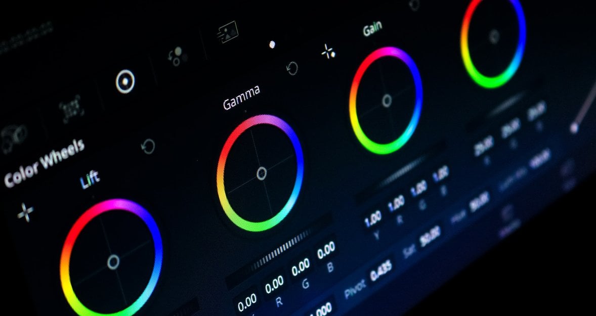
The Color Correction Process in Luminar Neo
Many people use Blackmagic Davinci Resolve Design or Adobe Lightroom for color grading but I recommend you Luminar Neo. With this photo editing software, color correction becomes a simple operation! The image enhancement technology will help beginners to complete the task and speed up the work of professional photo editors. The user-friendly interface will lower the entry threshold for beginners.
Final Thoughts
If you want color-grading images to be a regular part of your post-processing routine, just keep practicing. Use old photos before you move on to new ones. Experiment with the tools available. Save all of your photos that you will practice on and study them to determine which ones work best for you. Video grading can be the best toolset for creating cinematic masterpieces that tell real stories and show the mood of the scene.