June 01
11 min. to read
How to Create a Stunning Travel Brochure: Unleashing the Magic of Design
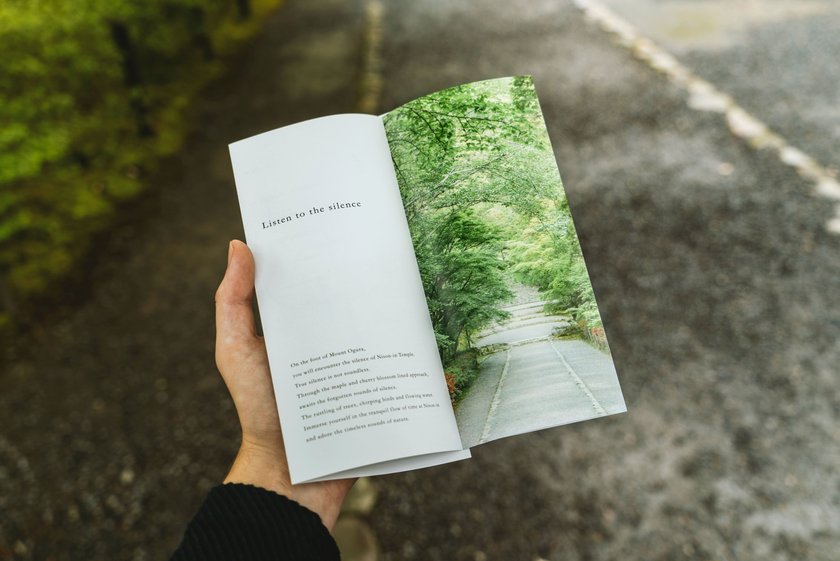 Brochures are one of the best ways to spread the word about your vacation destination. However, not everyone knows how to make them appeal to potential customers. Today we're going to talk about that and more!
You can develop a leaflet template, make a preview, and make any adjustments to it with the help of the great photo editor Luminar Neo! This app will be a perfect addition to the toolkit of the novice or pro designer as the tools based on AI technology do the lion's share of the work for the user. A huge number of tools for manual editing, too, will not leave anyone indifferent.
Travel Brochure: Your Gateway to Memorable Adventures
 The tourist brochure is designed to tell the visitor what awaits him in the chosen place, like the travel guide. He will see the location of interesting historical sites or recreational facilities, the way to the sea, and much more. The main purpose of the pamphlet is to attract potential customers. Accordingly, special attention should be paid not only to the design of the brochure for travel but also to its content. The effectiveness of the advertising campaign as a whole depends on its perception.
How to Make a Travel Brochure: A Step-by-Step Guide
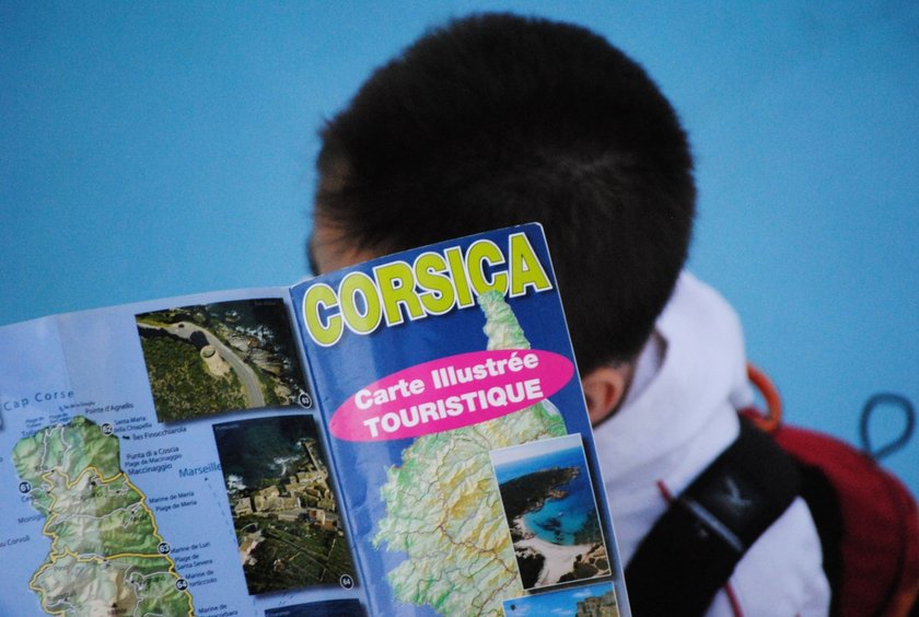 Making a good brochure is not so easy. Only at first glance, it seems: "Fi, another travel pamphlet". In fact, there are hundreds of nuances that the designer needs to take into account to get a good result. Firstly it's the format and the target audience. Even the time of year matters!
An in-depth understanding of the subtleties can only be gained with experience. We'll list the basic rules that apply to all types of pamphlets. Although this is a general guide, it will help you find the right way and make a working design. If you want to use a real photo for your brochure, remove backgrounds from images, and AI pictures to enhance will help you edit it.
Understanding the Purpose and Target Audience
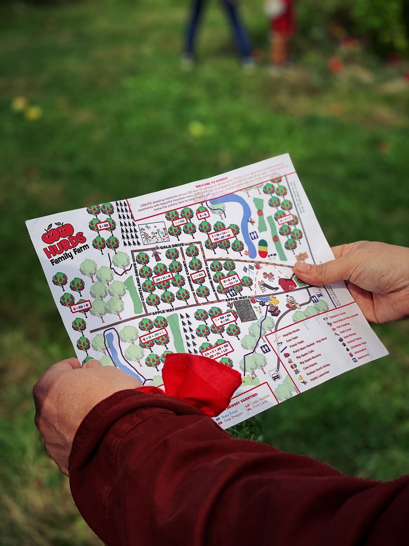 Before you think about how to create a travel brochure, you need to think about its target audience. A marketing project is a complex structure that includes many areas. The main one is the definition of the target audience. Focusing on a mass of people with different sets of characteristics is inherently wrong. One and the same advertisement cannot get an equal response from people of different sex, social status, age, income, places of residence, and so on. All these features should be analyzed in advance and only on the basis of the results to begin to compose the pamphlet. Ultimately, the effectiveness of the pamphlet, design, style, and other components directly depends on the needs of the audience. For young people bright designs, original prints, and bold illustrations will be more appealing. Older people can choose a restrained version but with clearly marked information (a detailed description of the product, price, and benefits of its purchase).
Planning and Research
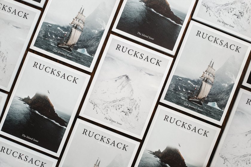 To create a travel brochure, you must first make a plan. The finished work must meet these criteria:
- Informativeness. You need to briefly explain what you offer, and the advantages of ordering services from you.
- Brevity. Avoid long sentences and long headlines. There are other tools to detail the object of advertising, including graphics.
- A reference to an attraction, event, or vacation spot.
If it corresponds to the traveling brochure, it is advisable to talk about the popularity or history of the place, or institutions providing unique services near the place you describe.
Choosing a Captivating Design
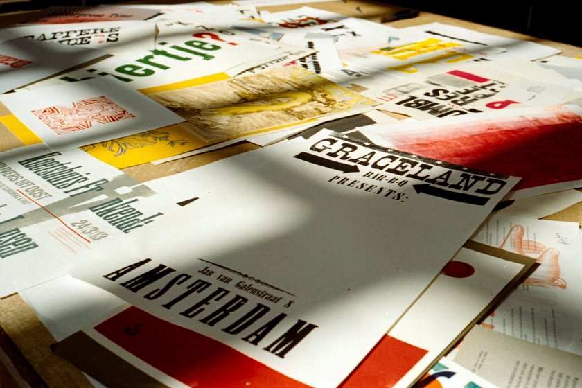 How to make a travel brochure? It is important to think about travel brochure design in advance. Visualization is of decisive importance when creating such a brochure.
A person who receives a pamphlet on the street or in a store will not take the time to study it carefully, but will certainly assess the content in a cursory glance. The easiest way to arouse the interest of the audience is through a good graphic. This can be a photo, geometric shapes, illustrations, or other options.
Quality visualization is the key to ensuring that your ad will linger in the hands of the recipient. The automated photo editing application will help you design and make your work much easier. Pay attention to Luminar Neo, and you won't want to replace it for anything!
Compelling Content Creation
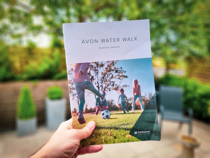 Given the peculiarities of psychology, the text content of advertising is evaluated in the last place. For this reason, you need to avoid lengthy explanations and loud epithets. Instead, provide more specifics and information that can draw attention to the travel destination.
Since the brochure often acts as an invitation card, try to indicate the benefit it gives to its owner. It should be something that will make you put it in your pocket and then come to the event as well. For example, free admission or a cocktail, or maybe a discount on services. Be sure to highlight this information. If you are adding graphical elements and need to remove items from pictures, use the handy AI-based tool.
Visual Elements and Imagery
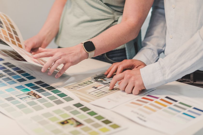 A printed or travel e-brochure has to attract attention, so you should choose a cool photo or illustration. Considering that it's still a cheap form of advertising, you won't be able to afford all the polygraphic frills (cut-outs, UV-lacquers, etc.). Therefore, try to make a design that will be spectacular on its own.
Organizing and Structuring
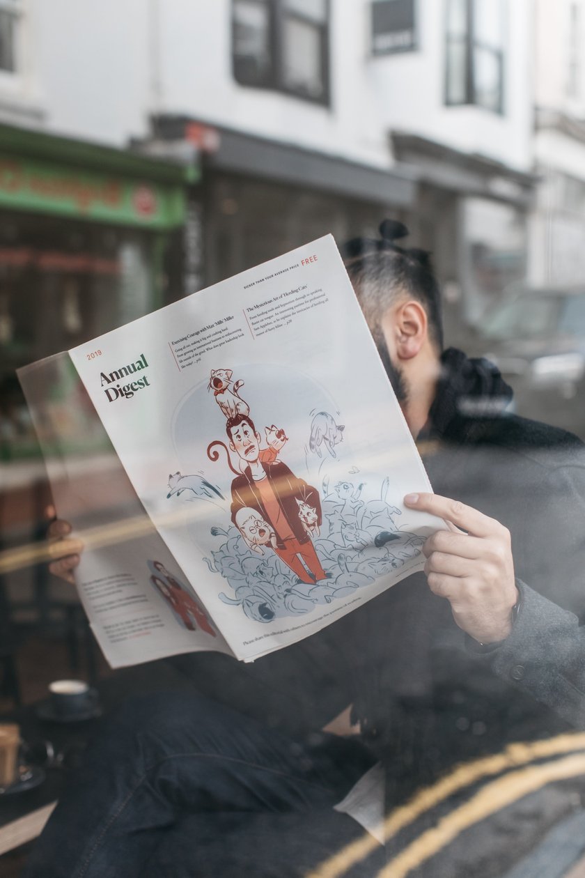 You can make a travel brochure layout in 10-15 minutes if you have access to an AI image editor or online image editor like Luminar Neo. In addition, it is important to place all the necessary information about the vacation opportunity in a prominent place. Be sure to put the address of places of interest for travel and tourism, contact phone number, and location of vacation establishments.
How to Choose the Perfect Design for Your Travel Brochure
 Focus on your target audience. Before ordering the printing of leaflets, you need to study all the data about your potential customers. Pay attention to their gender, age, occupation, and hobbies. All this will help you choose the style and design.
In some cases, it will be correct to use either a leaflet with pictures or a purely text booklet. However, most often experts recommend combining the two types of information presentation. Make sure that the ratio between pictures and text is about the same.
How to Write Compelling Content for a Travel Brochure
Give preference to double-sided pamphlets. Printing a one-sided leaflet will of course be much cheaper. However, making the most of the free space on the professional travel brochure is more efficient. Proper presentation of information. Structure your entire text by inserting talking points, headings, and subheadings where possible.
Conclusion
I hope you got enough information to create a great pamphlet that will help tourists during their trip. I'm sure you will definitely succeed, and you will be able to make the perfect booklet.
FAQ
What Key Elements Should I Include in My Travel Brochure?
Laconic and quality design! No one will read the pamphlet long and carefully. It should attract attention and deliver information quickly.
How Can I Make My Travel Brochure Stand Out From the Competition?
Quality and inspiration are the keys to success. The better you work out the design and graphics of your booklet, the more likely it is that it will appeal to tourists during their vacation.
Should I Focus More on Visuals or Content in My Travel Brochure?
Of course, on the visual part, since it is the first thing people pay attention to.

 >
>

