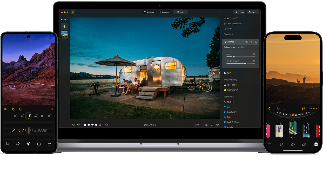
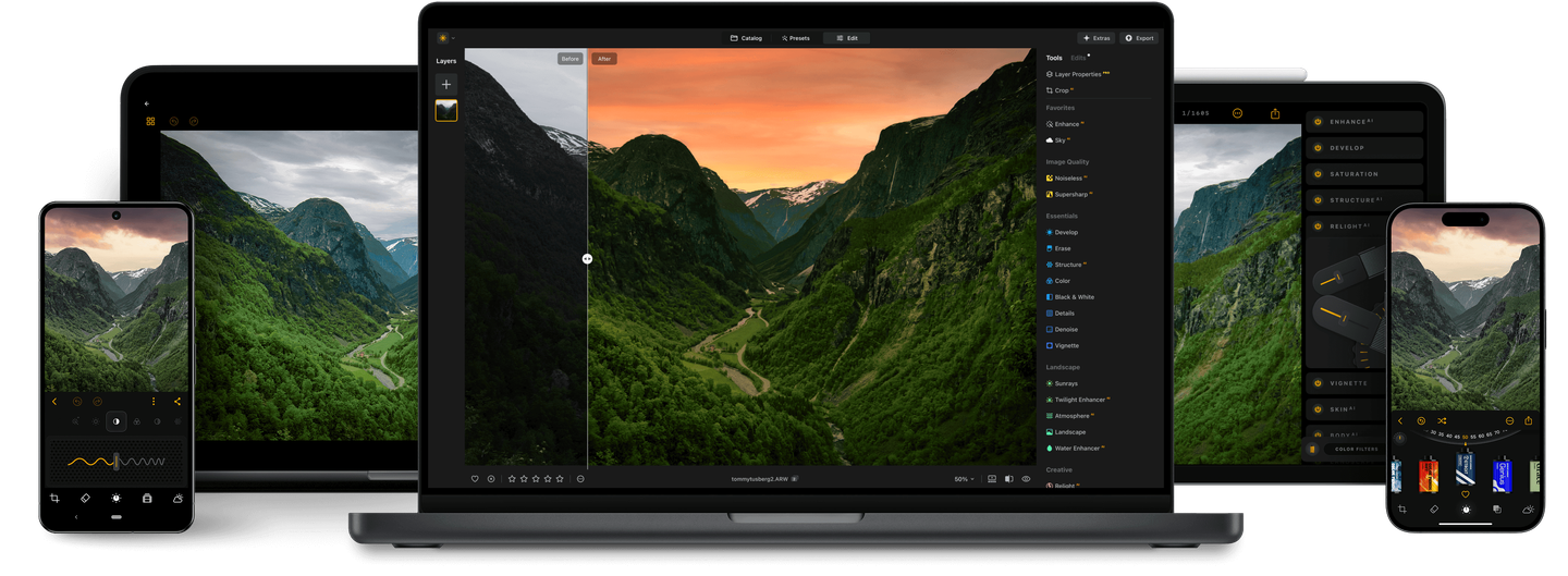
With support for raw files, exporting in all major file formats, layers, masking, and much more,
photography editing software Luminar Neo meets all your editing needs.
AI image enhancement
Artificial intelligence (AI) technology detects which areas of your photo should be enhanced. Just move one slider and watch as adjustments are accurately applied.
Clone tool
Replace unwanted or damaged pixels with pixels of your choosing from anywhere in your photo. Easily cover up damage or blemishes.
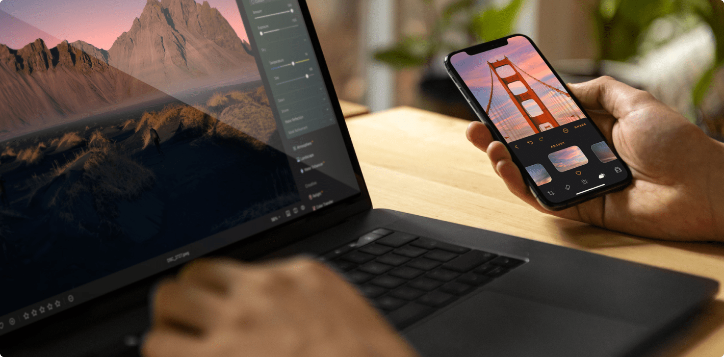
Raw editing
Luminar Neo supports over 1000 cameras. It works with JPEG, PNG, and TIFF files, many raw files (including CR2, CR3, NEF, ORF, and RAF), and even more file formats.
Dodge & burn
Take full control over the lighting in your photos. Regulate the amount of light in a particular area to draw attention to it.
Layers support
Use layers to combine multiple elements in one project. Layers can contain photos, textures, and adjustments.
Color enhancement
Use this tool for precise control over colors. Adjust brilliance, warmth, contrast, and balance in a matter of seconds.
Non-destructive editing
Your original image is always safe. Review and make changes to your edits whenever you like.
Crop and resize
Automatically adjust composition, crop, and perspective. Change the aspect ratio and effortlessly resize an image.
Lens correction
Remove any image flaw caused by optical distortions. Defringe, remove a vignette, or remove chromatic aberrations in one move.
Batch processing
Save time by applying the same adjustments to multiple photos using batch processing. Conveniently apply adjustments to a large set of images shot under similar conditions.
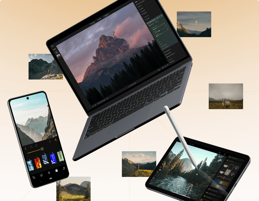
Discover Luminar Neo’s capabilities
With Pro Tools, you can sharpen, denoise, upscale, and merge exposures or panoramas to reveal every detail exactly as you imagined it.
Upscale
Enlarge your photos while preserving every detail and texture.
Original
Apply Upscale
BeforeAfter
Supersharp AI
Restore perfect sharpness and bring out crisp, defined edges.
Original
Apply Supersharp AI
BeforeAfter
Noiseless AI
Effortlessly remove digital noise for clean, high-quality images.
Original
Apply Noiseless AI
BeforeAfter
Focus Stacking
Combine multiple shots to achieve flawless focus throughout the frame.
Original
Apply Focus Stacking
BeforeAfter
HDR Merge
Blend different exposures to reveal balanced light and vivid tones.
Original
Apply HDR Merge
BeforeAfter
Panorama Stitching
Seamlessly merge photos into stunning wide-angle scenes.
Transform any photo from ordinary to breathtaking in just a few clicks. With intelligent AI tools guiding every step, you’ll enhance, refine, and perfect your image effortlessly.
BeforeAfter
Just 4 steps to spectacular results
Transform any photo from ordinary to breathtaking in just a few clicks. With intelligent AI tools guiding every step, you’ll enhance, refine, and perfect your image effortlessly.
Original
GenErase
SkyAI
Color
Sunrays
Retouch like a pro in four steps
1. Open your image
Start with any portrait you’d like to enhance.
2. Add Skin AI
Smooth skin and remove imperfections for a flawless, natural look.
3. Use Face AI
Adjust face light, refine shape, and enhance features effortlessly.
4. Apply Mood
Color grade your photo to set the perfect tone and atmosphere.
5. Enjoy the result
BeforeAfter
Edit a whole photoshoot in one click
Save time with batch editing and a rich selection of presets that keep every photo looking stunning.
Luminar Neo is a powerful, next-generation photo editing software designed to inspire creativity and deliver professional results with ease.
It features an intuitive interface and a modern toolkit powered by cutting-edge AI technologies. With a flexible, performance-focused engine at its core, Luminar Neo offers faster editing, seamless layer-based workflows, and precise control over every detail. Whether you're enhancing portraits, transforming landscapes, or exploring your artistic vision, Luminar Neo makes the editing experience both efficient and enjoyable.
How do I get Luminar Neo?
You can buy Luminar Neo on this page and download your photo editor from the My Account page. This software to edit photos is available for macOS and Windows as an application and plug-in.
What is the difference between Luminar plans?
Perpetual Desktop License
By purchasing the perpetual desktop license, you will get a license that gives you the right to own Luminar Neo forever. With this plan, you can:
Get access to updates, bug fixes, improvements, and some new features. But big upgrades may require extra upgrade payments.
Get access to the features released in Fall 2025 Upgrade (Restoration, AI Assistant, Light Depth) & Spring 2026 updates.
Use all the tools, including AI photo editing tools, as well as Pro Tools.
Use the Generative tools (GenErase, GenExpand and GenSwap) during 1 year calculated from the purchase date
Activate Luminar Neo on 2 computers.
Perpetual Cross-Device License
Includes everything in the Perpetual Desktop License, plus:
Perpetual access to Luminar Mobile on 3 mobile devices.
Luminar Ecosystem with cross-device editing (mobile to desktop).
Access to Spaces – web galleries that allow you to share your work online.
Perpetual Max License
The ultimate plan. Includes everything in Perpetual Cross-Device, plus:
Access to the Creative Library with exclusive creative assets like presets, LUTs, overlays and video tutorials.
*Creative Library courses are available in English only.
Can I start editing on one device and finish on another?
Yes. Cross-device editing is included in the Perpetual Cross-Device License and Perpetual Max License. You can begin on your mobile phone and pick up right where you left off on your desktop or tablet. Currently, it works one-way works one-way (mobile → desktop); the reverse flow (desktop → mobile) will be added in a future update.
How many devices can I use Luminar Neo on?
You can use Luminar Neo lifetime or subscription plan on 2 devices.
Two seats allows you to install and activate Luminar Neo on two devices at once, regardless of their operating system. For example, you can use one seat to activate Luminar Neo on a Mac and the other one to activate Luminar Neo on a Windows computer, or you can use both seats for your Windows or macOS computers. Any combination works!
Moreover, you can always manage your activations in your Skylum Account. You are able to add even more seats in your Skylum Account if you have multiple computers or want to share your license with people who need access.
Are you changing computers or upgrading your device? You can reset a license from your old machine at no cost and activate that license on your new device. Just log in to your Skylum account or do it directions in app during the installation process on a new device. Learn more
Do you offer educational and military discounts?
Educational and military discounts are available starting from the official release date and are calculated from the regular sale price.
To secure the special price, click here.
If you own a previous version of Luminar or Aurora HDR, we also provide a loyalty discount. Click here to redeem it.
What does a photo editor do?
A photo editor is a software responsible for enhancing and manipulating digital images to achieve a desired visual outcome. Their primary function is to improve the overall quality and appearance of photographs using image enhancement, restoration, composition, and other image manipulations.
How to use Luminar Neo?
Luminar Neo is a convenient photo editor that allows you to easily edit images. After installing it, you can import images, sort them in the Catalog, apply one-click Presets, edit your photo with tools and layers, and then save and export photos for sharing.
How to install Luminar Neo?
After purchasing Luminar Neo you will be emailed all the instructions on how to quickly install Luminar Neo and start using it.
What is the latest version of Luminar Neo?
You can check the latest version of Luminar Neo and what improvements it has here.