Family Photo Color Schemes That Enhance Every Portrait
March 12, 2026

Discover how a well-chosen color palette for your family photo shoot can transform your portraits, making every shot and smile truly expressive and unforgettable.
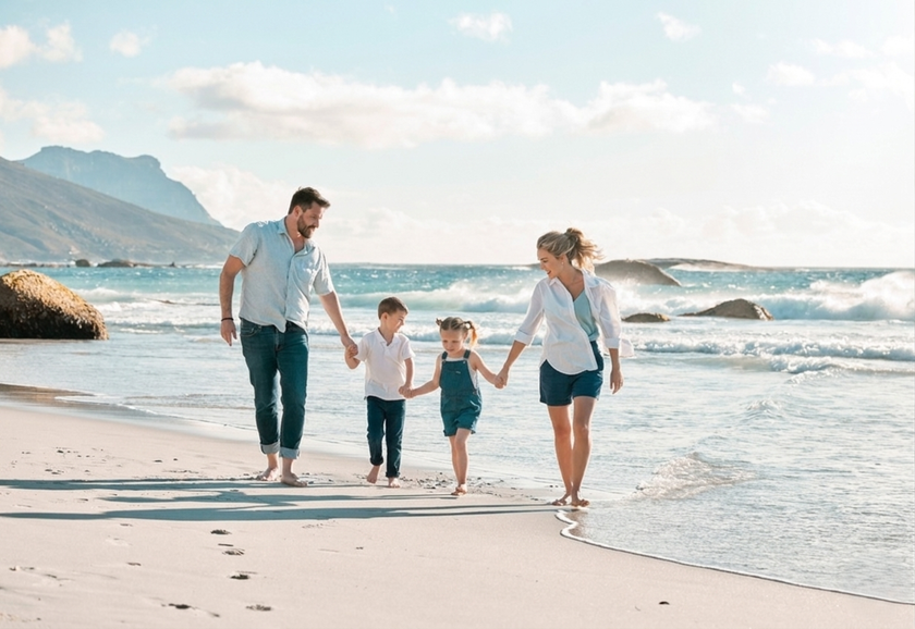
The clothes are ready, the location is chosen, and the children are already waiting for the promised ice cream after the shoot. The family stands in front of the camera, and at first, everything looks right: smiles, good lighting, and poses that are not stiff. However, as soon as you look at the photos taken, you get the feeling that something is wrong. Your gaze is constantly drawn to one sweater or dress, as if they are competing with the faces for the leading role.
This feeling doesn't arise from someone being dressed poorly. Most often, the items simply don’t complement each other, and the frame reads as a set of separate images rather than a single scene. When there is harmony between the family photo color palette, it helps bring people together in one composition, softens contrasts, and focuses attention on emotions. That is why portrait color schemes should be considered as carefully as posing or location.
Don’t feel like reading the whole breakdown right now? Here’s a tighter, more practical summary of what actually changed.
Key Takeaways
Harmony beats “nice clothes”. The article’s core point is that a mismatch makes the frame read as separate people, while a coherent family photo colour palette softens contrasts and pulls attention back to emotions.
Pick the mood first, then choose colours that serve it. The text gives ready palettes like sea calm (deep navy + ivory + warm sand), graphic contrast (graphite + milky + muted burgundy accent), light and airy (powder pink + light grey + white), and cool restraint (dark blue + steel grey + pale blue).
Repetition creates cohesion. A large-family scheme works when the main light tone appears on major people and the accent colour repeats in small details across different outfits.
Use “temperature” as your X-axis, matching cool locations (city, water, bright studio) with blues/greys and warm locations (parks) with caramel/cream/terracotta—so the environment and clothing don’t fight each other.
Accents should be small and intentional. The guide suggests using accessories or small elements (like a red scarf or a bright yellow detail) to contrast the dominant shade without turning the frame into a colour clash.
Neutrals should dominate. It follows the 60-30-10 logic: neutrals take about 60%, and you can build depth by mixing shades of one colour (light grey + graphite), keeping the lightest item closer to the face.
Avoid the three common mistakes. Identical outfits only work when the whole shoot is built around that concept, neon/acid colours create glare, and big logos can break the “special moment” mood unless the setting is casual.
Final Verdict: Choose a mood-led palette, repeat the base tones across people, keep accents small, and lean on neutrals—that’s what makes a family portrait feel unified instead of visually noisy.
Best Color Combinations to Elevate Your Family Portraits
It is easier to choose colors for a family portrait if you first decide what mood you want to convey in the photo: calm and clean, warm and homely, or more graphic, with contrast. Once you have decided on the direction, clothes cease to be a set of mismatched items and start to work as a single cohesive mechanism. Palettes that work consistently in family portraits:
Sea calm. The frame becomes clean and collected when deep dark blue appears in the images, accompanied by ivory and warm sand. This mood is easy to capture near water or in bright locations where the background doesn’t distract attention.
Graphic contrast. If you want a restrained, “adult” image, the base should be built around graphite and milky tones, with a single controlled accent in muted burgundy. You can shoot in a studio or among urban architecture, where there are many straight lines to complement the image.
Light and airy mood. For a delicate shoot without sharp contrasts, it is better to keep everything in pastel light, with powder pink supporting light gray and white, preventing the frame from darkening.
Light and airy mood. For a delicate shoot without sharp contrasts, it is better to keep everything in pastel light, where powder pink supports light gray, and white prevents the frame from “darkening.”
Cool restraint. A calm, cinematic logic is suitable for winter or a modern interior, where dark blue retains depth, steel gray adds structure, and pale blue softens the overall tone. This creates a sense of neatness without excessive formality.


 For large family photo color schemes, the repetition of shades in the frame is required. When the basic light tone appears in many images, and the accent color is scattered in small details across different people, the portrait looks cohesive: in such a scheme, the color supports the mood and doesn’t distract attention from the faces. If the photos don't turn out well enough due to the camera or surroundings, you can always use a photo editor.
Your AI-Powered Photo Editor for MacOS and Windows
Discover Now!How to Use Color Theory for Choosing Family Photo Outfits
 When choosing clothes for a family photo shoot, color theory works like a coordinate system—you need to set the conditions for the image. Your X on this plane will be the temperature of the shades. Cool locations, such as city streets, water, or a bright studio, are better suited for dark blue, gray, and muted blue. But in a warm park, such an image will look out of place, so it is better to give preference to caramel, cream, or, as a last resort, terracotta colors.
Once you have chosen the main colors, it's time to think about Y for color schemes for family photos: the look needs separate color accents that harmoniously contrast with the dominant shade. Usually, accessories or small elements of the look are used to integrate them, such as a red scarf for a dark suit or a bright yellow scarf over a patterned brown dress.
If you can't come up with good images on your own, don't be upset and cancel the shoot. All you need to do is find a few photos of the location online and upload them to the color palette generator in Skylum's product. In just a few clicks, you'll get a selection of colors from the images that you can use to create images.
Tips for Incorporating Neutrals and Bold Colors Effectively
When creating a family picture color scheme, neutral shades occupy 60% of the entire image in accordance with the “60-30-10” rule. Therefore, their effective use largely determines how the final image will be perceived.
The easiest way to create volume using basic gray, white, black, or similar tones involves changing your approach: instead of combining different colors, combine different shades of the same color. For example, a good combination is light gray and graphite shades—it looks stylish, doesn’t turn into a random mixture, and is suitable for most family photos. The main thing here is that the lightest element should be closer to the face.
If your wardrobe doesn't boast a variety of solid-color items, don't worry, because printed clothing can also serve as a neutral part of your look. The main thing is that the colors used in the print are either opposite to the color of the item or are in the same range. How it looks: white patterns on a black hoodie or a light gray pattern on a dark gray jumper.
Common Color Mistakes to Avoid in Family Photos
 The most underestimated mistake when creating collective memories is choosing identical outfits. Of course, it can look good, but only if the whole process is built around the idea itself. Even leading fashion photographer Steven Meisel would not be able to take a good picture at a wedding where the groom, his brothers, and father are dressed in identical suits. Therefore, the first step is to choose a unique look that reflects your style.
The second most common mistake in choosing family photo color schemes is excessive colorfulness. The presence of shiny, acid, or neon shades is a direct path to glare. An advanced family photo editor, such as Luminar Neo, can eliminate this defect, but it is better to avoid conditions where the light will behave aggressively.
The last thing to talk about is the appropriateness of the image. T-shirts or hoodies with large logos will look natural if the images are taken in a familiar setting, such as a picnic, a game of football in the yard, or a pizza party. However, if the scene involves a rare event or a special moment, the family's image should be more restrained.
Seasonal Color Schemes Perfect for Family Portraits
 The choice of seasonal palette directly depends on the natural lighting and color scheme of the location. Color schemes for family photos in summer or spring are best built around pastel tones, mint, and soft blue, which naturally emphasize the freshness of awakening greenery. In autumn, it is worth using wine, ochre, and emerald shades that harmonize with the golden foliage. Winter portraits benefit from the contrast of cool blue or noble gray tones with the addition of expressive red accents.
You can add naturalness to your seasonal look by choosing the right material. Soft cashmere or thick knitwear in warm brown tones will add coziness to cool autumn photos, while airy, light linen will help complement the atmosphere of a summer beach with a special lightness. Natural seasonal colors in clothing made from materials that understand this “vibration” eliminate sharp color contrasts, making the picture visually pleasing without unnecessary effort.
Styling Tips: Matching and Coordinating Colors for Everyone
 Even an outfit consisting of shades of the same color can be made to look voluminous! Don't believe it? Here are a few techniques you can use for family photos:
Focus on the silhouette. If the color is monochromatic, the eyes automatically begin to focus on the cut. That's why the combination of a fitted turtleneck and loose pants of the same color looks aesthetically pleasing.
Color contrast. An effective combination that looks expensive and successful. Take 90% white and dilute it with 10% black through a belt or edging.
Combination of materials. Different surfaces absorb light differently: this creates depth even in a neutral outfit of one color. Try wearing a matte gray wool sweater with a gray silk skirt or leather pants to see this effect.
Different textures. Wear an oversized jacket made of stiff wool (men's silhouette) over a soft knitted dress. This contrast between “armor” and “body” is the basis of a modern, expensive look.
When choosing family pictures color scheme for an outfit, it may not always be possible to follow the “textbook” and put together strictly correct styles. The main thing is that the image looks cool and stands out from the rest without overshadowing your loved ones.
If the resulting images don't seem deep enough, use the AI color grading feature in Luminar Neo to achieve high-quality results without losing detail. Artificial intelligence can improve images visually, and if you want, it can help you remove objects or even adjust the lighting.
Accessorizing to Complement Your Family Photo Color Palette

The principle for selecting additional details is the same as for selecting the top and bottom parts of the outfit: matching the family photos' color scheme, using appropriate materials, and providing appropriateness.
Most often, accessories are jewelry made of precious metals or something small but functional, such as a belt. They don't take up much space, look unobtrusive, and make the outfit more comfortable to wear.
If the photo shoot is timed to coincide with a specific event, you can use themed decorations. For a birthday, these could be party hats, for New Year's Eve—gifts or hot chocolate, and so on. The main thing is that the photo is filled with joyful smiles, making you want to look at it again and again.
A Simple Formula for Creating a Harmonious Family Portrait
Well-chosen family color schemes for pictures transform a family portrait into a manifesto of closeness and replace the outdated “all in one style” approach with a deep compositional unity. A successful image helps to break free from restrictions and shyness, opening your heart completely to the joy of being with your loved ones.