The Rule of Space in Photography: Composing Images That Tell a Story
January 15, 2025

Learn how to use the Rule of Space in photography to create compelling, story-driven compositions. This guide offers practical tips to elevate your visual storytelling skills.
Imagine a bird soaring across a vast sky, a runner sprinting toward the horizon, or a single flower standing defiantly in an empty field. The space around them isn't just emptiness—it's a canvas, a storyteller, and an emotional amplifier. In photography, this delicate dance between subject and surrounding is guided by the “Rule of Space.”
The Rule of Space isn't just about balance—it's about mood, narrative, and impact. By deciding how much empty space to leave around your subject, you can evoke serenity, tension, isolation, or even anticipation. Whether you're capturing landscapes, portraits, or dynamic action shots, mastering this rule unlocks the power to create images that not only catch the eye but resonate with the soul.
In this blog, we’ll delve into how the Rule of Space works and explore ways to use it across different styles of photography, helping you craft compelling, story-filled images that truly connect.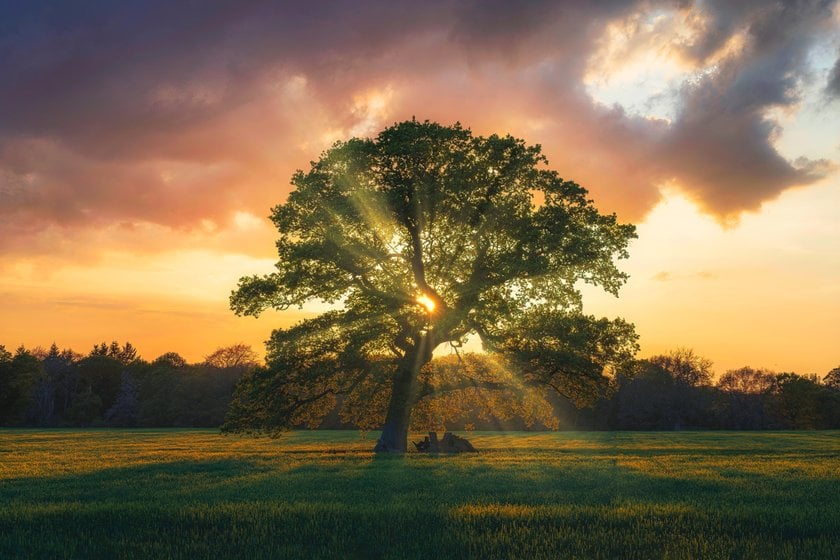
What is The Rule of Space?
The Rule of Space in photography is the practice of leaving empty space, or "negative space," around a subject to create a sense of movement, direction, or focus.
This simple yet powerful idea enhances your photos by balancing the composition and drawing attention to your subject. By using the Rule of Space, your images can tell clearer, more compelling stories and feel more complete and visually engaging.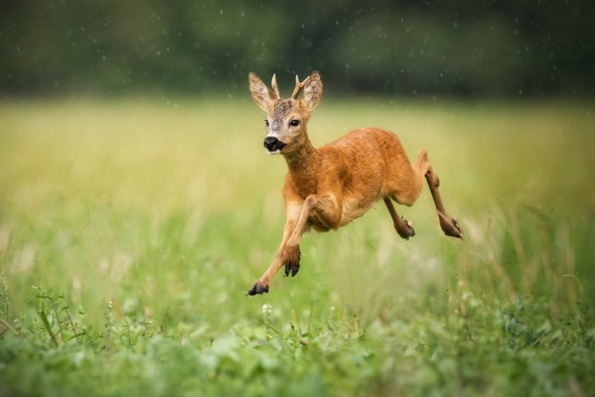
Why Space is Important in Composition
Space is important in photography because it helps guide the viewer's eye and creates a sense of balance. Using space around the subject can make the photo feel more organized and focused. Space can also create different moods, like making a photo feel calm, lonely, or full of movement.
For example, giving a subject room to move into makes the viewer feel like something is about to happen, while too much empty space can make a photo feel empty or lost. The right amount of space can tell the story of the photo and make it more interesting to look at.
Types of Space in Photography
Understanding the different types of space is important to improving your composition skills. The two primary types are positive and negative space, but distinctions like active and passive space add further nuance.
Positive Space: This is the area occupied by the main subject in the frame and where the action or focus lies. It draws attention and tells the story of the image.
Negative Space: This is the empty or less busy areas around the subject. It can be plain or include small elements that don't distract from the main subject. Negative space provides breathing room, emphasizes the subject, and can evoke emotions like calmness, isolation, or tension.
Active Space: This is the space in front of a moving subject or where the subject is looking. Active space allows viewers to feel movement or wonder what lies ahead, enhancing the story.
Passive Space: This is the space behind a subject or around stationary subjects. It is less dynamic and often serves as a background. Passive space helps frame the subject without suggesting movement, offering balance and context.

How the Rule of Space Enhances Storytelling
Space can make a photo feel peaceful, tense, lonely, or dramatic by how much space is left around the subject and how it directs the viewer's attention. Here's how it works:
When there's a lot of empty space around a subject, it can make the subject feel small, lonely, or vulnerable. This sense of isolation creates emotional tension, making the viewer feel a sense of emptiness or solitude.
On the other hand, when a subject is placed in a tighter or more confined space, it can create a feeling of pressure, urgency, or tension. It might suggest something is about to happen, adding drama or anticipation.
If the space is evenly distributed around the subject, it can create a peaceful, calm feeling. The balance of space can make the viewer feel more relaxed and connected to the subject, almost like everything is in harmony.
If there's space in front of a moving subject (like a runner or car), it gives a sense of direction and forward motion. This can suggest that the subject is heading toward something important, creating suspense and excitement.
Changing the space in an image can completely change the story or feeling it conveys. Below are some examples.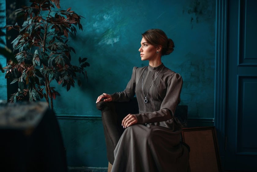
More Space Around a Subject
Story: A person seated alone in a room, with empty space around them, can evoke a sense of solitude or introspection. The negative space emphasizes the subject's mood, drawing attention to their pose and expression while creating a quiet, contemplative atmosphere.
Change in Space: Zooming in and filling the frame with the person could shift the focus from their surroundings to their emotions, making the image feel more personal and intimate.

Less Space in Front of a Moving Subject
Story: A close-up portrait with less space around the subject emphasizes their facial features and expression, creating a more intimate and personal connection with the viewer. The focus shifts entirely to the subject, making their mood and details stand out.
Change in Space: Adding more space around the subject could create a feeling of detachment or place them within a broader context, making the image feel less intimate and more about their surroundings.
Subject Close to the Edge of the Frame
Story: A person positioned near the edge of the frame, with empty space on the opposite side, draws attention to their gaze and creates a sense of anticipation or thoughtfulness. The composition invites viewers to wonder what lies beyond the frame, emphasizing the subject's emotions and the unseen.
Change in Space: Moving the subject closer to the center of the frame would create a more balanced composition, shifting the mood to one of stability and calmness, focusing entirely on the subject rather than the space around them.
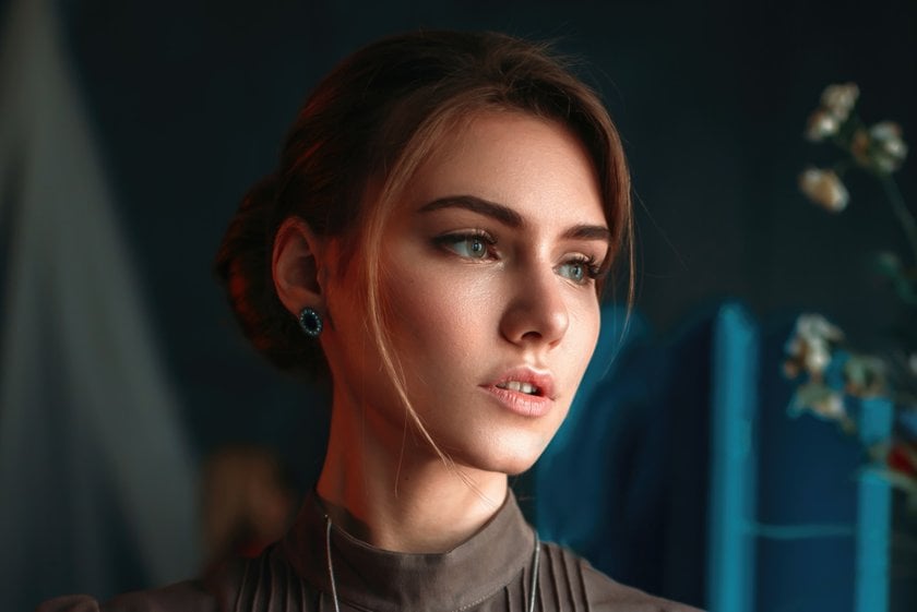
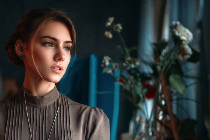
Tight Space Around the Subject
Story: A close-up portrait like this, with minimal empty space around the subject, creates an intense focus on their expression and emotions. This tight framing draws the viewer’s attention entirely to the subject, emphasizing their mood and inviting a deeper connection.
Change in Space: Adding more space around the subject, such as including more of their surroundings, can shift the mood of the image. It softens the focus on their emotions and provides additional context, helping the viewer consider the environment as part of the story.

Practical Tips for Using the Rule Of Space
1. Leave Space in the Direction of Gaze or Movement
Leaving space in front of where a subject is looking or moving suggests that something is happening or is about to happen. It creates a sense of balance and adds anticipation.
Example: A person looking off-camera with an open space in front makes viewers curious about what is ahead, enhancing the storytelling.
Tip: Avoid "cramping" the subject by placing them too close to the edge of the frame, as it can feel awkward or incomplete.
2. Use Negative Space for Minimalist Compositions
Negative space can simplify the composition and make the subject stand out. Clean and uncluttered frames focus on a single subject and create a sense of calm, balance, or solitude.
Example: A lone figure walking across a vast, empty desert highlights solitude and scale.
Tip: Experiment with using skies, water, or other plain backgrounds as negative space.
3. Experiment with Framing and Cropping
Framing allows you to include or exclude elements that affect balance and context. Cropping can shift focus or enhance the sense of space, helping control how viewers see the image.
Example: Cropping a portrait to leave more space in front of the gaze can enhance the feeling of openness.
Tip: Avoid cutting off limbs or important parts of the subject, especially if it disrupts the flow of the space.
4. Consider the Aspect Ratio
Aspect ratios influence the composition and balance of an image depending on the shape of the frame. A wide ratio (16:9) is ideal for landscapes as it emphasizes horizontal space. A square ratio (1:1) is better to create symmetry and focus.
Example: A panoramic shot gives space for expansive scenes, while a tighter ratio highlights subjects in closer quarters.
Tip: Choose an aspect ratio that complements your subject and story—wider for landscapes, square for symmetry or portraits.
5. Incorporate Foreground and Background Elements
Using layers of space by including foreground, middle ground, and background elements adds depth and dimension to your photos. Foreground elements draw the viewer in, while background elements provide context and scale, making the image more dynamic.
Example: A photo of a mountain with flowers in the foreground and clouds in the background adds visual interest and depth.
Tip: Use a wide aperture to selectively blur the background or foreground, directing focus to the main subject.

Common Mistakes and How To Avoid Them
Mistakes #1. Overuse of Space
Too much space can make the composition feel empty.
Tips to avoid the overuse of space:
Avoid placing the subject too far from the centre or creating too much space around it unless it enhances the narrative (e.g., in a story of isolation). Ensure the subject is still visible and prominent.
If you're leaving space for the subject to move or look into, ensure the rest of the composition doesn't become too empty or distracting. Space should guide the viewer's eye, not just be an afterthought.
Use leading lines, foreground, or background elements to create a sense of balance within the frame. The subject and its surrounding space should feel interconnected, not disconnected.
In large-scale scenes, consider the scene's scale, including something in the foreground to provide a sense of scale and anchor the viewer's eye.
Don't use too much empty space unless it has a clear reason (e.g., emphasizing solitude, serenity, or scale). Without context, the viewer may feel the image lacks focus or direction.
In vast landscapes, include something in the foreground to provide a sense of scale and to anchor the viewer's eye. Large, open spaces can be powerful, but they should still feel connected to the rest of the image.
Experiment with tight compositions that minimize empty space while still allowing the subject to “breathe.”
Mistakes #2. Ignoring Context
The context in your photographs is essential for telling a cohesive story.
Tips to ensure the context is always part of your composition:
Include elements that give context to the location, such as cityscapes, nature, or architecture, which help the viewer understand where the subject is and why it matters.
Use framing techniques, like doorways, windows, or natural elements, to ensure the subject feels anchored within the scene. This gives the viewer a sense of where the subject fits into the broader context.
If you're photographing a person in a landscape, showing the person in relation to the vastness of the landscape helps the viewer understand scale and the emotional impact of the scene.
Don't leave too much empty space without context. Ask yourself: What is this space telling the viewer about the subject or story? If there's too much unused space, it may feel disconnected.
Elements like weather, lighting, objects, and people can contribute to the narrative. For example, a person walking through a rainstorm might feel more significant if you capture the wet streets or reflections.
If you're using isolation as a technique, make sure there is enough information within the frame (either through the subject's appearance, the environment, or background elements) to make the isolation meaningful.
Capture moments that show the subject's relationship with its surroundings, like a runner on a trail, a cyclist in traffic, or a bird in flight. The movement within the context of the environment gives the story a clear direction.
Mistakes #3. Unbalanced Composition
Balanced compositions are crucial to create visually pleasing and harmonious photographs.
Tips to help you create a balanced composition:
Positioning the subject off-centre can lead to a more dynamic and visually pleasing composition while maintaining balance using surrounding elements (rule of third).
If you have a large subject on one side of the frame, balance it with a smaller object or area of interest on the other side to create equilibrium.
Incorporate leading lines that extend from one side of the frame to the other. These lines help balance the composition by creating a visual path that ties together various elements in the image.
If you use symmetry, the subject should be centred, and the elements on either side should match in size or importance. For asymmetry, you can balance a dominant subject with smaller or more subtle elements on the opposite side.
Use framing elements, like doorways or branches, to frame your subject, ensuring they balance the composition and give context to the subject.
Use negative space to balance out large or heavy subjects. For example, if your subject is positioned to the right, a large empty space to the left can help balance the composition.
Step back and experiment with different angles. Adjust your height or move left or right to find the composition that creates the best balance in the scene.
The Bottom Line
Using the Rule of Space in photography can make a big difference in how your images feel and what they communicate. By considering how much space to leave around your subject, you can guide the viewer's eye and create emotions like calmness, tension, or excitement. Whether you're shooting portraits, action shots, or landscapes, space helps tell your story in a balanced and meaningful way. With some practice, you can use space to create photos that capture attention and leave a lasting impression.


